Hamborrower on October 9, 2025 5:55 pm This is better than 90% of the garbage graphs and maps I see on r/dataisbeautiful every day.
Dame87 on October 9, 2025 6:00 pm The fact that chocolate is disliked as much as vanilla is shocking, bullshit result. I demand a recount
parisianraven on October 9, 2025 6:11 pm I thought this was a metaphor for macron’s approval ratings over the years
Farmer4Lyfe on October 9, 2025 6:12 pm If you flip it upside down, it will show Macarons by popularity.
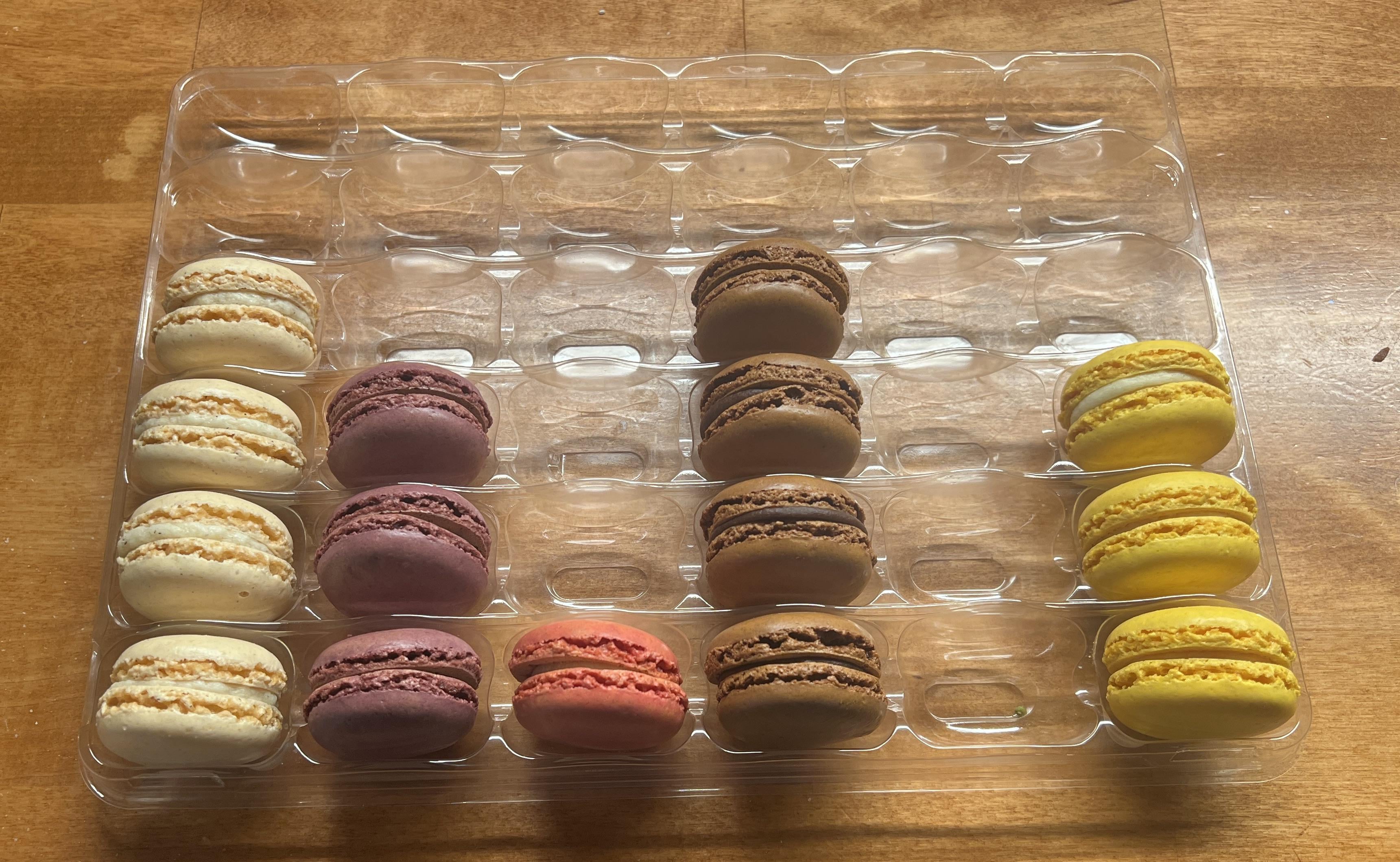
redwater92 on October 9, 2025 6:16 pm L —> R Vanilla, Mixed Berry, Strawberry + Cream, Chocolate, Pistachio, Lemon
AcanthisittaNo8115 on October 9, 2025 6:19 pm In our house we eat the ones we like less first.This way, we can look forward to the next one tasting better than the last.
Happythoughtsgalore on October 9, 2025 6:20 pm Lol, same vein as “A pie is a live pie graph of how much pie has been eaten”
kattermelon on October 9, 2025 6:21 pm Recently I learned that macarons are made out of almond flour, which tracks, because I am allergic to almonds and got terribly sick after eating one.
asonnetfororpheus on October 9, 2025 6:22 pm Lemon would’ve been the last one to go in my house, only because that’s my favorite flavor of all time and I’d be saving the best for last.
stoompedpoo69 on October 9, 2025 6:23 pm My brain is so fucking cooked because I was trying to connect this to politics for a couple minutes

34 Comments
Mmm. Pistachio
Which one was the 5th column?
Nice way to frame it
Costco
r/dataisbeautiful lmao
Pistachio >
This is better than 90% of the garbage graphs and maps I see on r/dataisbeautiful every day.
Carrot flavour second most popular?
Pistachio supremacy!
I like it. Appropriate sub for this post.
My tray would be empty, all equally good in my eyes
r/dataisbeautiful
The fact that chocolate is disliked as much as vanilla is shocking, bullshit result. I demand a recount
Is column 2 ube?
Mmm, more lemon ones for me!
I totally agree with this graph.
What flavour are the purple ones?
What’s the flavor of the purple one second from the left?
Those are krabby patties, and no one can convince me otherwise
I like to get rid of my least favorite flavors first.
I thought this was a metaphor for macron’s approval ratings over the years
If you flip it upside down, it will show Macarons by popularity.
I like the brown and purple, send them to me.
L —> R
Vanilla, Mixed Berry, Strawberry + Cream, Chocolate, Pistachio, Lemon
In our house we eat the ones we like less first.This way, we can look forward to the next one tasting better than the last.
Lol, same vein as
“A pie is a live pie graph of how much pie has been eaten”
r/dataistasty
the sub’s pretty dead these days but perfect for r/data_irl
Recently I learned that macarons are made out of almond flour, which tracks, because I am allergic to almonds and got terribly sick after eating one.
Lemon would’ve been the last one to go in my house, only because that’s my favorite flavor of all time and I’d be saving the best for last.
My brain is so fucking cooked because I was trying to connect this to politics for a couple minutes
r/dataisedible
This is exactly how it should be
So, “no macaron” was the most popular?