
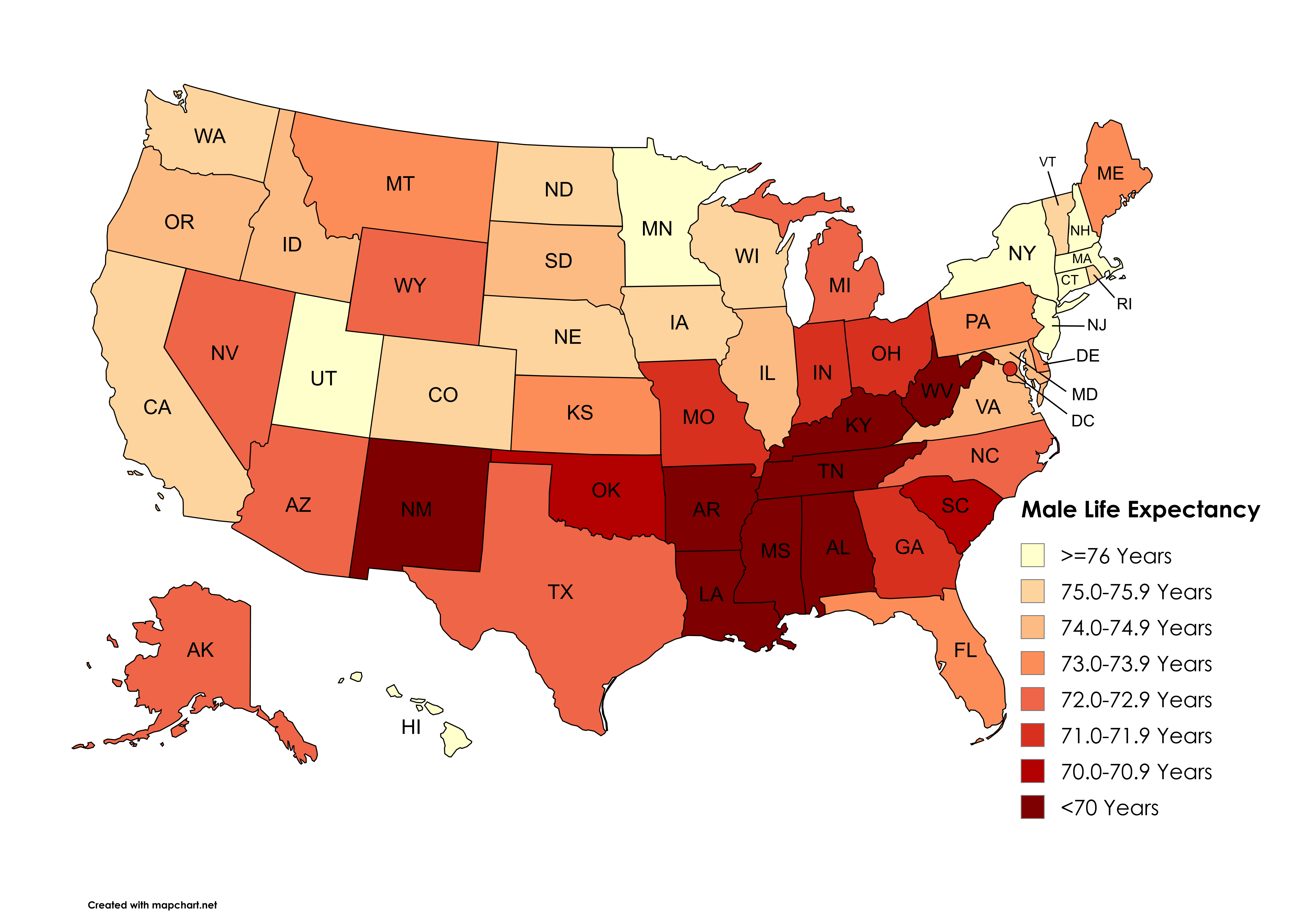
Data: CDC (https://www.cdc.gov/nchs/data-visualization/state-life-expectancy/index\_2021.htm)
Tool: Mapchart (https://www.mapchart.net/usa.html)
by snakkerdudaniel
Data: CDC (https://www.cdc.gov/nchs/data-visualization/state-life-expectancy/index\_2021.htm)
Tool: Mapchart (https://www.mapchart.net/usa.html)
by snakkerdudaniel
4 Comments
Data: CDC ([https://www.cdc.gov/nchs/data-visualization/state-life-expectancy/index_2021.htm](https://www.cdc.gov/nchs/data-visualization/state-life-expectancy/index_2021.htm))
Tool: Mapchart ([https://www.mapchart.net/usa.html](https://www.mapchart.net/usa.html))
People make a lot of jokes about New Jersey, but almost every one of these maps makes me feel like, “huh. Maybe that’s the direction to go.”
This is the same as the obesity map and education maps. More fast food, poor health care, lack of education on health in general. More die
These pictures need to be banned. At least bring in some other variable, *anything*, whether it’s income, race, or beaver population.
Like, thank you, I know black people and natives have low life expectancies, but this map causes people to just assume it’s political affiliation.