
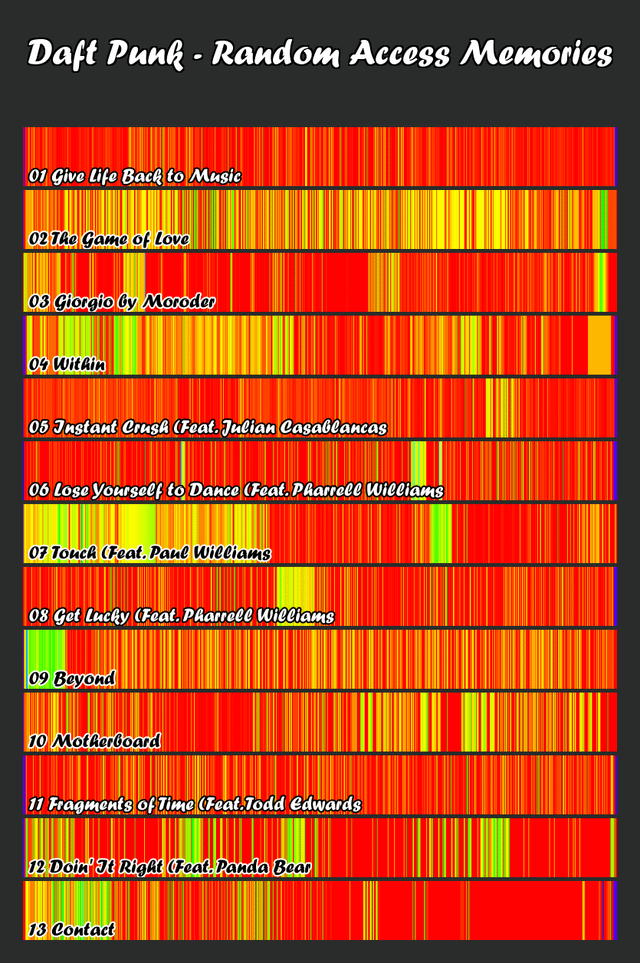
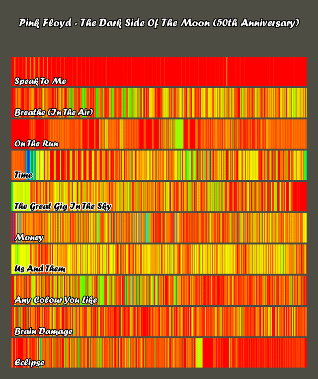
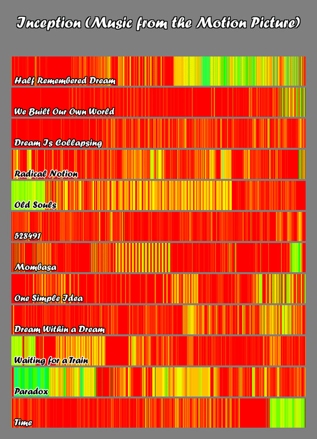
Over the past few months I've been working to automate my first album visualization tool so that other people could use it themselves. The general gist is that the human ear can hear from 20 Hz- 20,000 Hz in a logarithmic fashion and can see wavelengths from 400 nm-700 nm. Using an equation to fit the dominant frequency to a wavelength, the code generates a color for each piece of a song.
the process of the algorithm:
step 1. upload each song
step 2. cut song into 0.1 sec pieces
step 3. find dominant frequency at this point (from 20 hz-20,000 hz)
step 4. plug this value into the logarithmic equation to get a wavelength (400-700 nm)
step 5. each wavelength is a different color (e.g. 400 nm – violet, 700 nm – red)
step 6. collect each color
step 7. pretty gradient!
Let me know what you think, try it out, I'm welcome to changes on the script. If you would like a print or a specific album, let me know
The website is https://albumviz.netlify.net where it goes into more detail, shows the equation and more examples. As long as the album is on youtube and has a URL, it can be turned into a color fingerprint. Also, here's the repo for direct access https://github.com/camnoval/audiovisualizer
by camjam267
4 Comments
A few notes:
1) colors in the visible spectrum aren’t perceptually uniform. E.g. Yellow is lighter than both colors surrounding it. So using colors like that doesn’t lead to viewers interpreting high frequency colors as higher frequency sounds. You need a perceptually uniform color gradient for that.
2) frequency isn’t the only thing that matters in music. Have you considered mapping loudness or something else to the height of the bars?
I feel like this doesn’t tell me anything about the album or songs. Do you find your listening experience correlated to some feature of these bars? I kinda like the concept tho
this is pretty cool. i can feel it, esp based on knowing where the colors go in my memory of the song. your initial data would be a really good base for other time based things too – most of which i think would be a very different sampling method, like asking people to press a button when they feel excited or another when they are bored or both.
if you aren’t getting enough colors to show up (just see red green yellow) I think you could limit the range from 20hz – 15khz since 15-20 is just ear candy air and might not lead to any insights.
cool idea, you could do something for the color ranges.
How do you think this compares to a spectrogram?