
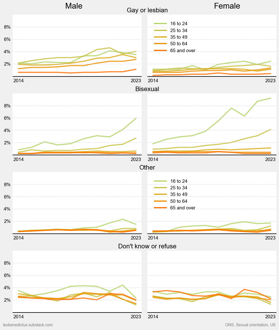
I made this using matplotlib in Python for this Substack post, where I explain a few caveats and raise a few questions about what might explain the changes. (NB the margins of error are quite wide in places.) The original source of the data is the ONS.
by Aggravating-Food9603
5 Comments
[removed]
Did you have to pick the most identical colors possible?
Probably should specify these are “non heterosexual” sexualities since “other” clearly isn’t including straight here lol
Where’s heterosexual? This doesn’t add up to 100%
Wouldn’t this be better as a stacked chart?