
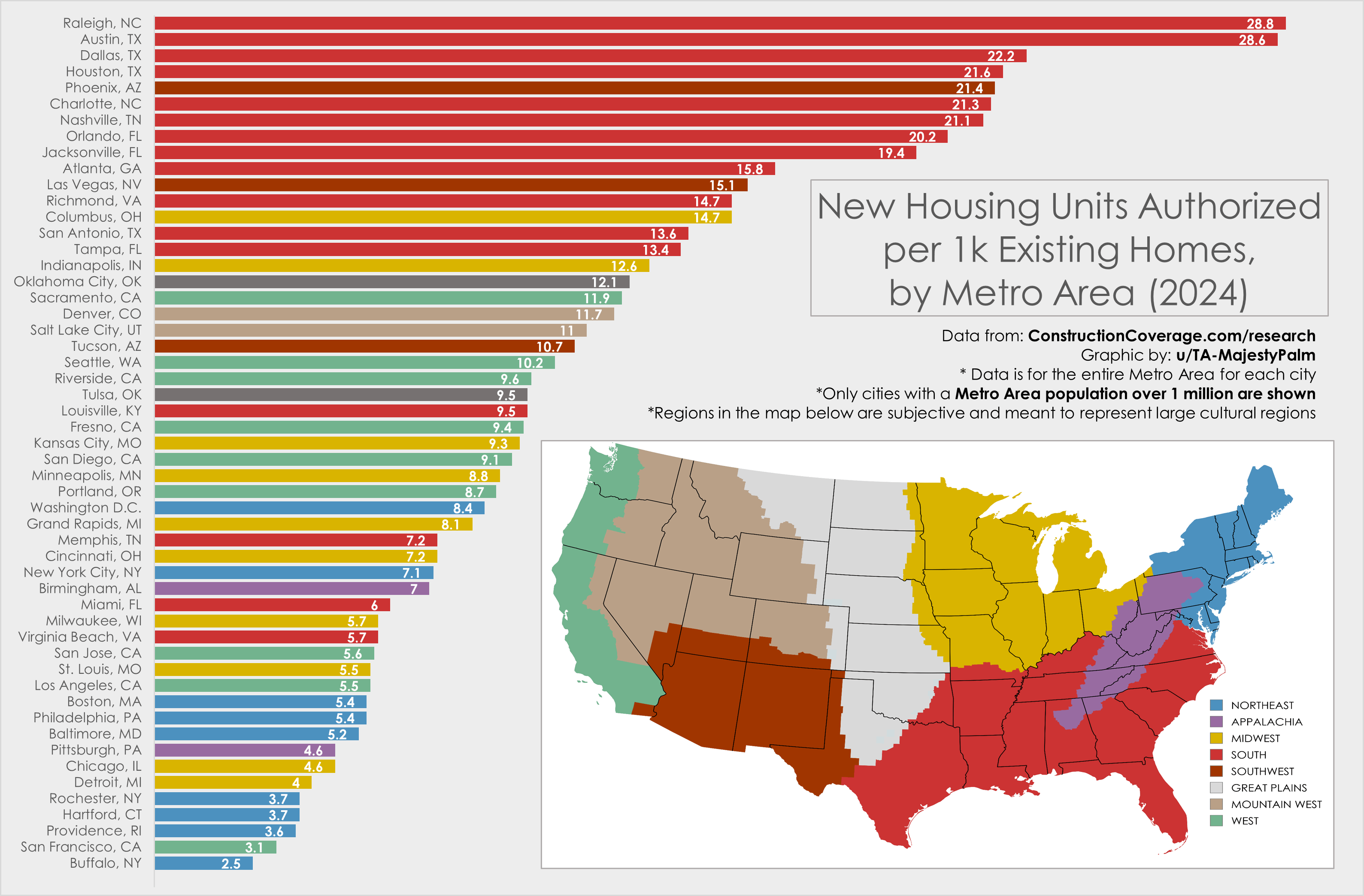
Graphic by me created in Excel, source data with much more info here: https://constructioncoverage.com/research/cities-investing-most-in-new-housing#results
-
Specifically, the values in this graph represent new housing units authorized per 1,000 existing units (in 2024).
-
All cities include the entire Metro Area, not just city limits. All Metro Areas over 1 million people in 2024 are shown.
-
I chose to color code by area to help identify regional trends. The top cities are all in the south or southwest, while the entire Northeast is towards the bottom of the graph.
by TA-MajestyPalm
19 Comments
Graphic by me created in Excel, source data with much more info here: https://constructioncoverage.com/research/cities-investing-most-in-new-housing#results
– Specifically, the values in this graph represent new housing units authorized per 1,000 existing units (in 2024).
– All cities include the entire Metro Area, not just city limits. All Metro Areas over 1 million people in 2024 are shown.
– I chose to color code by area to help identify regional trends. The top cities are all in the south or southwest, while the entire Northeast is towards the bottom of the graph.
Edit: I created a similar graphic of population growth for the same set of cities a month or so ago, which some may find interesting to compare: https://www.reddit.com/r/dataisbeautiful/s/Hv8OG5lyM2
The real story here is that this is the *only* correct way to divide the continental US by region
As someone who lives near San Jose… Yep. That tracks.
For what it may be worth, Rust Belt cities may not need more housing inventory, hence they aren’t building as much. Pittsburgh, for example, is currently below its peak historical population and so existing housing is still relatively inexpensive and available.
Sigh. Hello from the City of Oaks, can you bring your infrastructure with you when you move?
And people wonder why housing prices are falling in Austin
Yeah I just flew into Nashville and it looked like there were just fresh empty lots everywhere
Richmond VA is such a nice city. I’m glad to see it higher up on this list than I expected.
This just in. Areas with massive urban sprawl build more units. FYI these places are not building uo. Theyre building out
There’s a reason I moved from the northeast to the south. $1400 gets me a MUCH better housing situation in the south than in the northeast.
wonder what the breakdown of single family vs apartments and condos is. are cities building up more or out more or is it about equal?
Looking at the data is there an ideal spot to land? That way you could see overbuilding and underbuilding?
Raleigh is now a patchwork quilt of luscious green tree canopies and cleared acreage of red dirt awaiting townhouse development. It’s incredibly sad.
I don’t love the red next to maroon but otherwise solid map
Guys, I’m starting to think there might be some relationship between supply and demand. Has anyone worked on this before?
Completely agree that measuring new home construction as a percent of existing homes rather than an absolute number is the way to go here. And MSA vs actual city is also a good move. Nicely done, OP!!!
it might ALSO be interesting to see how this compares with actual city population growth.
How is Fort Worth not listed?
Birmingham is Appalachia and not southern?
👌
This is also an explanation of why the red states in this map are gaining congressional seats while the states in purple and blue are losing them