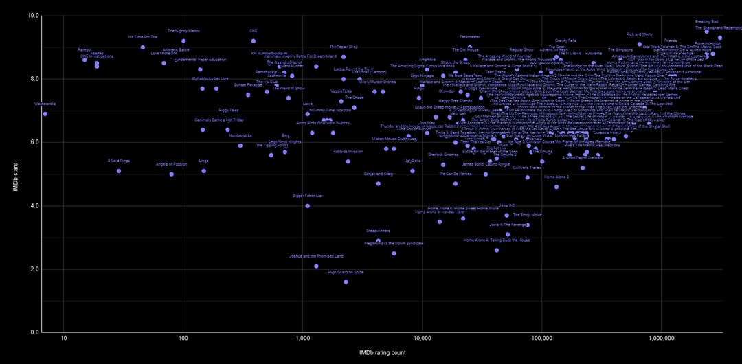
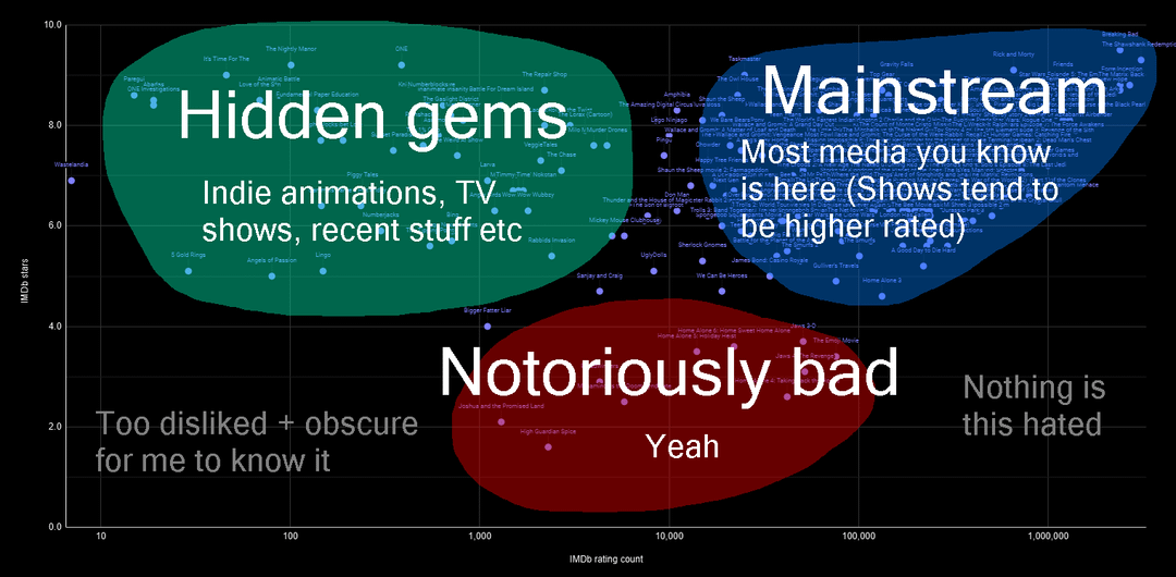
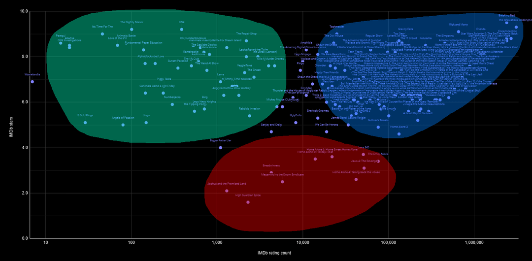
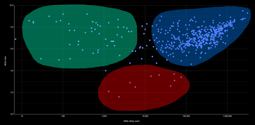
Sorry if the media titles are hard to read, I couldn't get higher quality versions of my Google Sheets graphs.
It would've been better if I used fuzzy gradient borders for the colored regions, since it's a completely subjective topic. I wasn't sure how to do that in FireAlpaca though.
by Hivvery

2 Comments
I can’t read a single label on the graphs due to the poor quality. Can you list the hidden gems in a comment?
oh nice one, but yeah the labels are kinda unreadable on this scale text always turns into a blur. imo a log scale on the X plus some clustering (like by genre or rating deciles) would make the patterns way clearer – you’d instantly see where the “top” stuff lives.
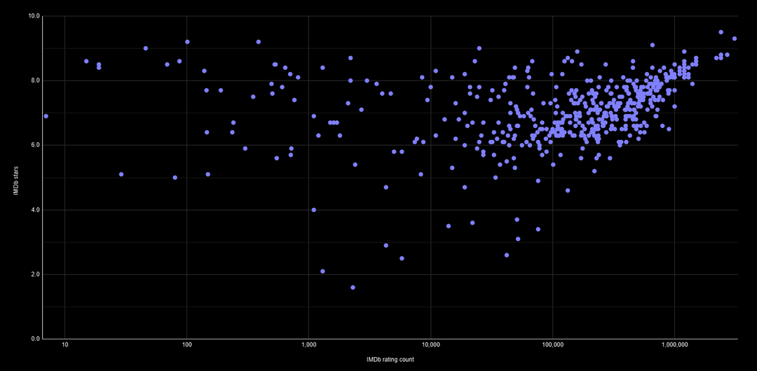
btw is this just rating vs number of votes? or did you also map a 3rd variable (size/color)?