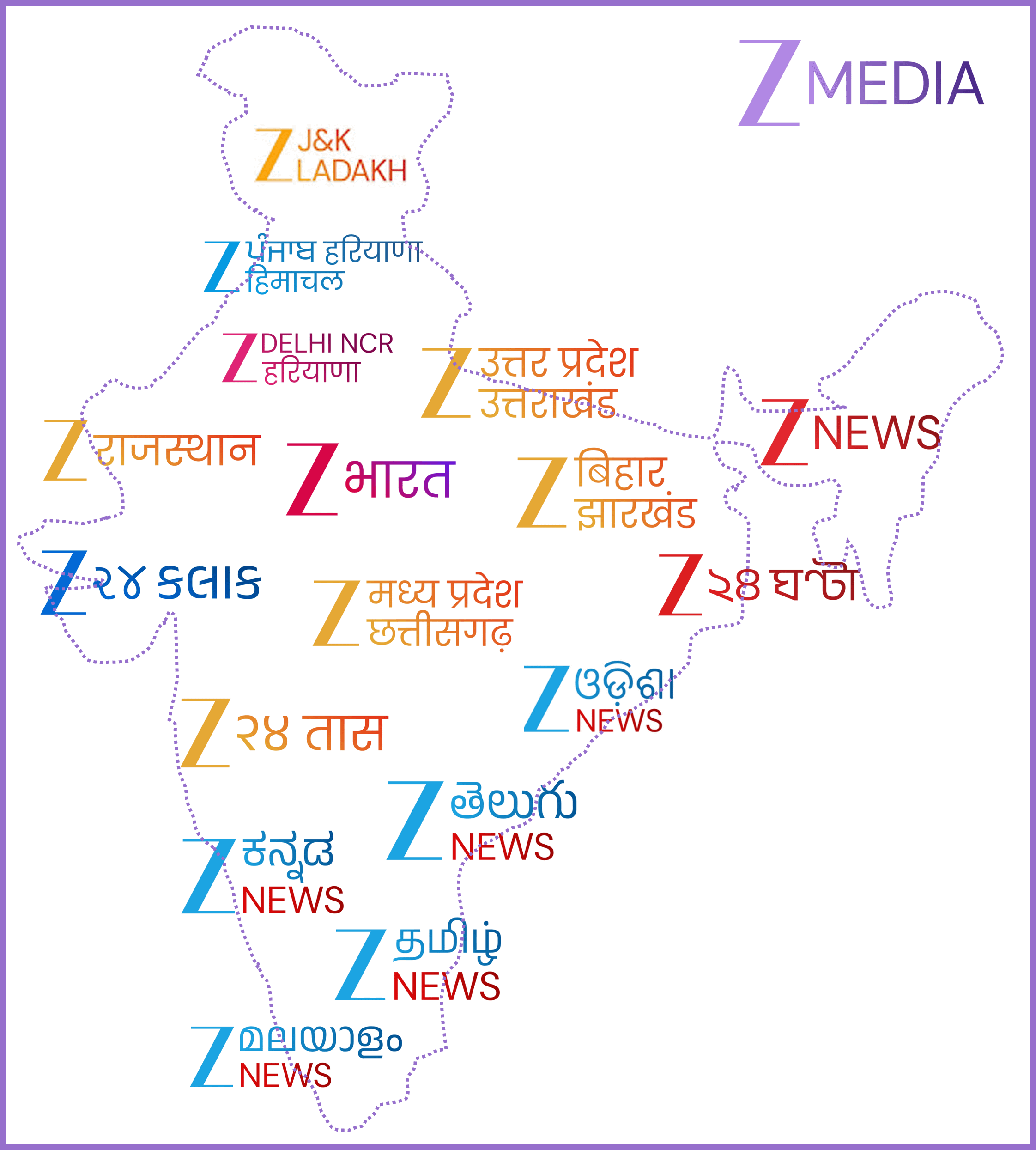
I’ve created a map that visualizes the various channels of Zee Media, segmented by regions. This shows how different channels are organized geographically, and provides insights into the regional diversity of programming. by Crazy_Bit8529
September 26, 2025Interactive US Federal Tax Bracket Visualization and Calculator – Sankey and Mekko graphs demonstrating how income is taxed across different tax brackets [OC]
triple_hoop on September 24, 2025 7:08 am “Created a map” you took a map and just added random labels on top of it. And it doesn’t even show any data about what you’re trying to portray.

1 Comment
“Created a map” you took a map and just added random labels on top of it. And it doesn’t even show any data about what you’re trying to portray.