
From my blog, see link for full explanation and analysis: https://polimetrics.substack.com/p/americas-looming-unemployment-insurance
Data sourced from Department of Labor: https://oui.doleta.gov/unemploy/DataDashboard.asp
Made in RStudio.
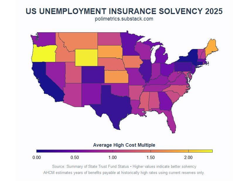
This map shows each state’s unemployment insurance trust fund solvency using the Average High Cost Multiple. This estimates how many years a state can pay benefits at historically high rates using only current reserves.
Warmer colors indicate better financial health while darker colors indicate less preparedness for a recession. This matters because when unemployment spikes during recessions, states with poor solvency may struggle to pay benefits or need federal loans.
by Public_Finance_Guy
4 Comments
I wouldn’t say beautiful, but certainly informative.
Problem is Covid really botched the “historically high rates” and it’s impacted the wealthier, more populated states the most since they wiped their funds dealing with it and would also have to wipe them again if they dealt with it again.
So you’re almost looking at a GDP-by-state map without realizing it:
[https://en.wikipedia.org/wiki/List_of_U.S._states_and_territories_by_GDP#/media/File:GDP_by_U.S._state_2024.png](https://en.wikipedia.org/wiki/List_of_U.S._states_and_territories_by_GDP#/media/File:GDP_by_U.S._state_2024.png)
So all of the major population centers where job loss is probably going to be higher than normal?
That’s…terrifying. Time to be unemployed in Wyoming or Oregon, I guess.
They will just start denying claims with little or no justification. What are you really going to do about it if you are relying on unemployment insurance, sue them and wait years for a resolution?