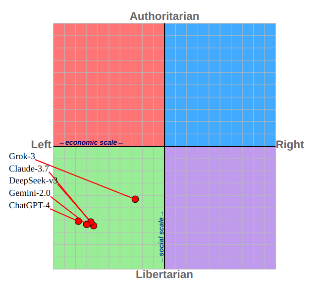
Political Compass test has 6 sections and 62 question to measure political inclination in different fields. Answer Options are : Strongly Disagree, Disagree, Agree, Strongly Agree. Response to these questions gives you 2 scores : Economical and Social, which is plotted here for 5 LLM models.
Of course AI doesn’t have the personal goals or desire (that we know of). So the test should reflect the nature of training data and AI engineers.
I’m trying to understand what point this post is trying to make. AI that thinks like Gandhi is less likely to turn into a Terminator.
Overbaron on
I love this info.
I’m sure people in each corner of this chart will blow their fucking heads for whatever reason or another because they hate the results.
Still, great to see some low-key stat reporting.
wdmartin on
At least in the U.S., red is typically associated with the Republican party, and blue with the Democratic party. So putting blue on the right and red on the left is somewhat counterintuitive. If this was a deliberate choice, I think it might have been better to use colors that aren’t strongly associated with specific political positions, or perhaps skip the color coding altogether. If the purpose is just to visually distinguish the sections from one another, you could just use a light grey in the upper left and lower right for a checker-board pattern with no color associations at all.
Think_Question_6677 on
Keep in mind that the political compass test is biased towards lib-left. It’s pretty hard to get an authoritarian or right leaning result if you are minimally concerned with human life.
bannakaffalatta2 on
Is this more the consequence of the bias aggregated from the data or of the tests bias?
thesayke on
This just shows how biased against liberalism the “political compass” questions are
Which makes sense, because they were made up by a rabid conservative
I wonder how the data was collected? The models usually are tweaked so that they don’t give their “opinion”. Tried on ChatGPT and when asked what’s the best answer to one of the questions the output was “it depends on your position”.
W0LFSTEN on
Could the conclusion be that a significant portion of the data these models are being trained on, for less black and white issues, is being pulled from the web? And so that data would reflect those who put out the most commentary – e.g. the younger generations? This roughly matches where I imagine your average zoomer would fall on the political compass.

9 Comments
Political Compass test has 6 sections and 62 question to measure political inclination in different fields. Answer Options are : Strongly Disagree, Disagree, Agree, Strongly Agree. Response to these questions gives you 2 scores : Economical and Social, which is plotted here for 5 LLM models.
Of course AI doesn’t have the personal goals or desire (that we know of). So the test should reflect the nature of training data and AI engineers.
Source : [https://www.politicalcompass.org/test](https://www.politicalcompass.org/test)
I’m trying to understand what point this post is trying to make. AI that thinks like Gandhi is less likely to turn into a Terminator.
I love this info.
I’m sure people in each corner of this chart will blow their fucking heads for whatever reason or another because they hate the results.
Still, great to see some low-key stat reporting.
At least in the U.S., red is typically associated with the Republican party, and blue with the Democratic party. So putting blue on the right and red on the left is somewhat counterintuitive. If this was a deliberate choice, I think it might have been better to use colors that aren’t strongly associated with specific political positions, or perhaps skip the color coding altogether. If the purpose is just to visually distinguish the sections from one another, you could just use a light grey in the upper left and lower right for a checker-board pattern with no color associations at all.
Keep in mind that the political compass test is biased towards lib-left. It’s pretty hard to get an authoritarian or right leaning result if you are minimally concerned with human life.
Is this more the consequence of the bias aggregated from the data or of the tests bias?
This just shows how biased against liberalism the “political compass” questions are
Which makes sense, because they were made up by a rabid conservative
https://www.reddit.com/r/neoliberal/comments/f3mnud/effortpost_the_political_compass_is_biased_and_i/
I wonder how the data was collected? The models usually are tweaked so that they don’t give their “opinion”. Tried on ChatGPT and when asked what’s the best answer to one of the questions the output was “it depends on your position”.
Could the conclusion be that a significant portion of the data these models are being trained on, for less black and white issues, is being pulled from the web? And so that data would reflect those who put out the most commentary – e.g. the younger generations? This roughly matches where I imagine your average zoomer would fall on the political compass.