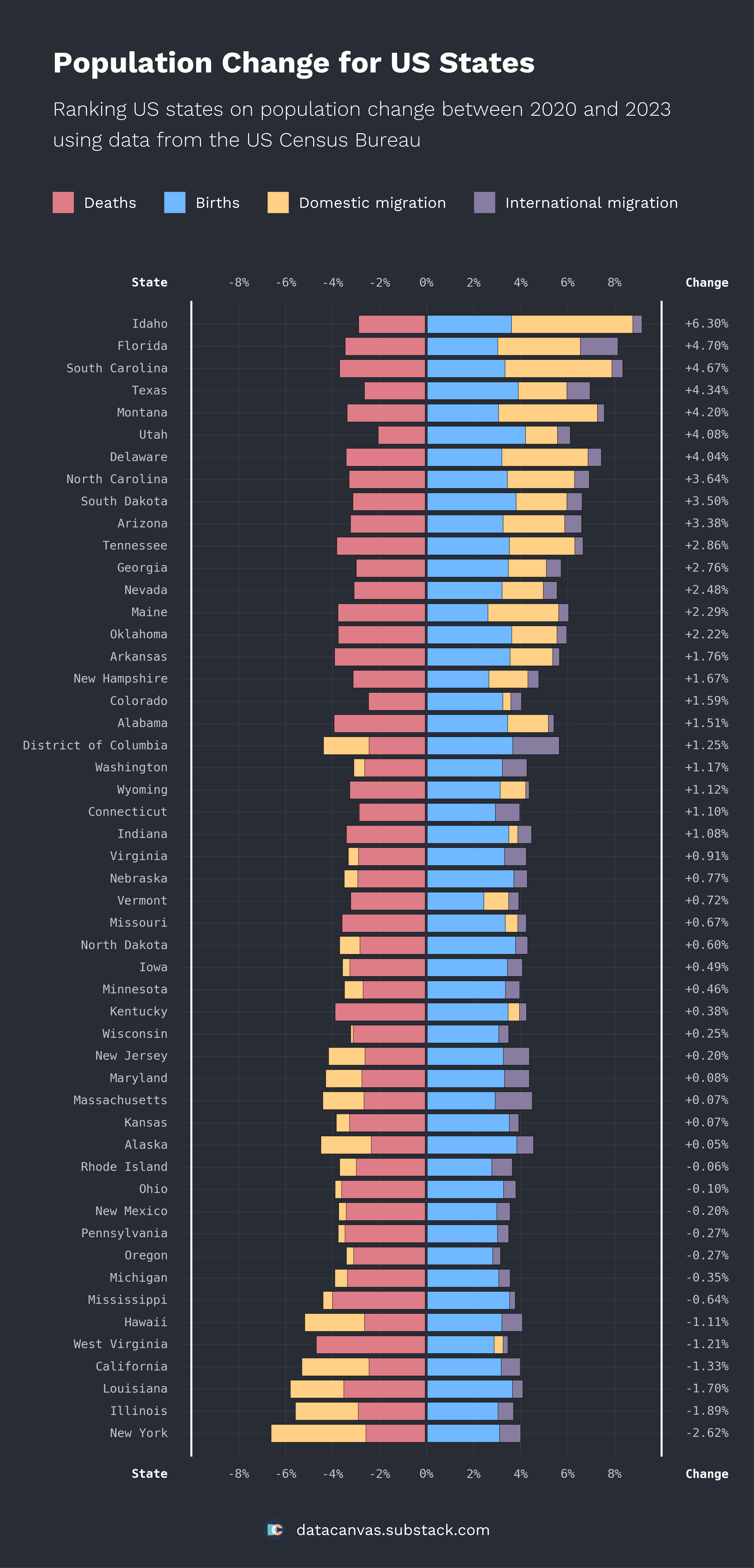
Thank you for all the great feedback on my map yesterday, showing the change in population for US counties. Today, I wanted to create another visualization about population change and the underlying reasons. This time, I look at states instead of counties.
The chart shows positive and negative contributors to population change. You can see the number of births, deaths, domestic migration, and international migration. Negative values contribute to the left side of the chart, and positive values to the right.
I ordered the states on the total change with the highest growth at the top. To the left, you can see the names of the states and the total change to the right.
Let me know what you think about both the data and the design. How can I improve the visualization and what would make it more interesting?
If you like the chart and design, feel free to visit my newsletter, [DataCanvas Daily](http://datacanvas.substack.com/), where I aim to publish one data visualization every day learning from the feedback I receive here at Reddit! 😀

3 Comments
Data source: [Census.gov (County Population Totals)](https://www.census.gov/data/tables/time-series/demo/popest/2020s-counties-total.html)
Tools used: Matplotlib
Thank you for all the great feedback on my map yesterday, showing the change in population for US counties. Today, I wanted to create another visualization about population change and the underlying reasons. This time, I look at states instead of counties.
The chart shows positive and negative contributors to population change. You can see the number of births, deaths, domestic migration, and international migration. Negative values contribute to the left side of the chart, and positive values to the right.
I ordered the states on the total change with the highest growth at the top. To the left, you can see the names of the states and the total change to the right.
Let me know what you think about both the data and the design. How can I improve the visualization and what would make it more interesting?
If you like the chart and design, feel free to visit my newsletter, [DataCanvas Daily](http://datacanvas.substack.com/), where I aim to publish one data visualization every day learning from the feedback I receive here at Reddit! 😀
Utah pumping out them kids 💪
Is something happening in Idaho that I’m missing?