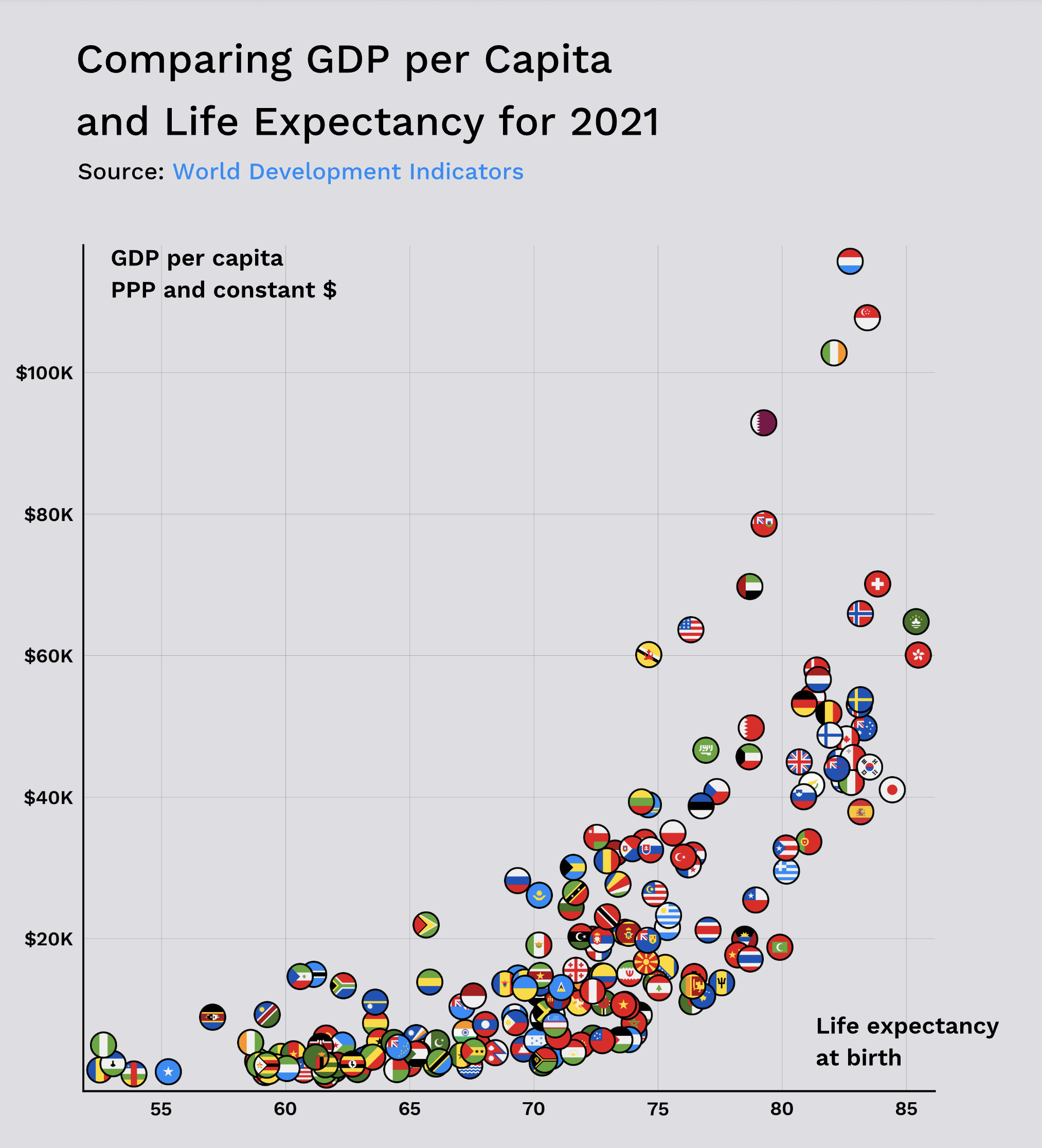
I wanted to see how well it works adding flags to a scatterplot without any additional information, and I think it works ok.
I’m aware that many countries are invisible since other flags cover them, but I decided to keep it that way since the most interesting data points are the ones outside of standard distribution.
I guess that not everybody know all of the flags, but hopefully you know enough of them 😛
Any ideas for a better approach? 🙂
Also, some countries are missing since I don’t have information for them in the original dataset. The missing countries are mostly small island nations, but I’m also missing North Korea, Syria, Yemen, Venezuela, and Turkmenistan.

3 Comments
Data source:
* [Life expectancy at birth, total (years)](https://data.worldbank.org/indicator/SP.DYN.LE00.IN)
* [GDP per capita, PPP (constant 2017 international $)](https://databank.worldbank.org/metadataglossary/world-development-indicators/series/NY.GDP.PCAP.PP.KD)
Tools used: Matplotlib
I wanted to see how well it works adding flags to a scatterplot without any additional information, and I think it works ok.
I’m aware that many countries are invisible since other flags cover them, but I decided to keep it that way since the most interesting data points are the ones outside of standard distribution.
I guess that not everybody know all of the flags, but hopefully you know enough of them 😛
Any ideas for a better approach? 🙂
Also, some countries are missing since I don’t have information for them in the original dataset. The missing countries are mostly small island nations, but I’m also missing North Korea, Syria, Yemen, Venezuela, and Turkmenistan.
I hope you like it!
And if you do, you can find the visualization and some additional information in my newsletter: [https://datawonder.substack.com/p/gdp-per-capita-and-life-expectancy](https://datawonder.substack.com/p/gdp-per-capita-and-life-expectancy)
The only flag I recognize are USA Ireland and I think that is Iran
These maps are kinda skewed though. It’s dead center COVID. It’s not really indictive of normal.