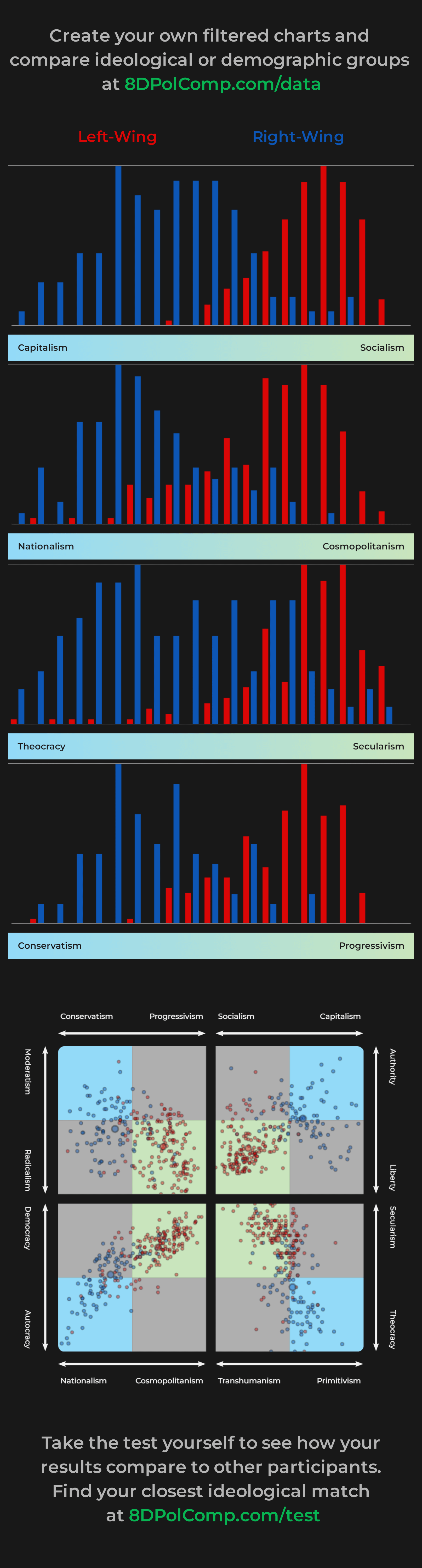
A histogram showing the political positions of self-identified left and right wing test participants across 8 ideological spectra. This data and far more visualisation options can be found at 8dpolcomp.com/data. [OC]
A histogram showing the political positions of self-identified left and right wing test participants across 8 ideological spectra. This data and far more visualisation options can be found at 8dpolcomp.com/data. [OC]
Data is recorded from voluntary test submissions with additional optional demographic and self-identification questions proposed after completion.
The 8DPolComp chart at the bottom of the graphic shows 8 axes across 4 charts, with each individual submission represented by a dot in each chart. Averages are shown in each chart by a larger dot. The chart is configured such that the end of each spectrum typically viewed as left-wing lies in the centre of the graphic, with the right-wing ideologies lying on the corners.
These charts were produced using the data filtering and visualisation tool available at [8dpolcomp.com/data](https://www.8dpolcomp.com/data). The tool is comprehensive and permits a variety of filtration options, including the ability to create and compare data across multiple sets of filters. Answers to individual questions by different filtered datasets can also be explored.
Charts are produced using chartjs. More information about the test, data, and visualisation options are available at [8dpolcomp.com](https://www.8dpolcomp.com). Leave a comment if you have any questions or suggestions regarding the test or data 🙂
a-usernameddd on
Who, I ask, who decided on these colors and to put the labels “Left-Wing” and “Right-Wing” on the side corresponding to the opposite category?

2 Comments
Data is recorded from voluntary test submissions with additional optional demographic and self-identification questions proposed after completion.
The 8DPolComp chart at the bottom of the graphic shows 8 axes across 4 charts, with each individual submission represented by a dot in each chart. Averages are shown in each chart by a larger dot. The chart is configured such that the end of each spectrum typically viewed as left-wing lies in the centre of the graphic, with the right-wing ideologies lying on the corners.
These charts were produced using the data filtering and visualisation tool available at [8dpolcomp.com/data](https://www.8dpolcomp.com/data). The tool is comprehensive and permits a variety of filtration options, including the ability to create and compare data across multiple sets of filters. Answers to individual questions by different filtered datasets can also be explored.
Charts are produced using chartjs. More information about the test, data, and visualisation options are available at [8dpolcomp.com](https://www.8dpolcomp.com). Leave a comment if you have any questions or suggestions regarding the test or data 🙂
Who, I ask, who decided on these colors and to put the labels “Left-Wing” and “Right-Wing” on the side corresponding to the opposite category?